
Premier Properties
OVERVIEW
Role: UI Design, UX Copy, Wireframing, Prototyping, Interaction Design, Responsive Design Framework
Tools: Figma, Miro, Adobe Photoshop
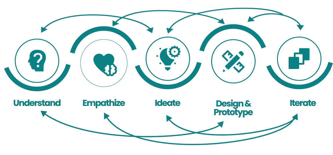
Design Process


Challenge: Real estate investment is an increasingly popular way for individuals to achieve financial security. It is an exciting experience, but often daunting and complicated. Inexperienced buyers need access to reliable and straightforward information about their potential property investments.
Solution: A user friendly, responsive web app with an extensive database of properties based on user’s specified needs. This web app will provide them with the expertise needed to get started efficiently and provide information that is trustworthy.

To better understand the user’s needs, motivations, and pain points, I created a User Persona, based on information provided in the design brief

Based on the user stories from the project brief, I created user flow diagrams to understand and visualize what pages must be included in the app for users to achieve their desired goals

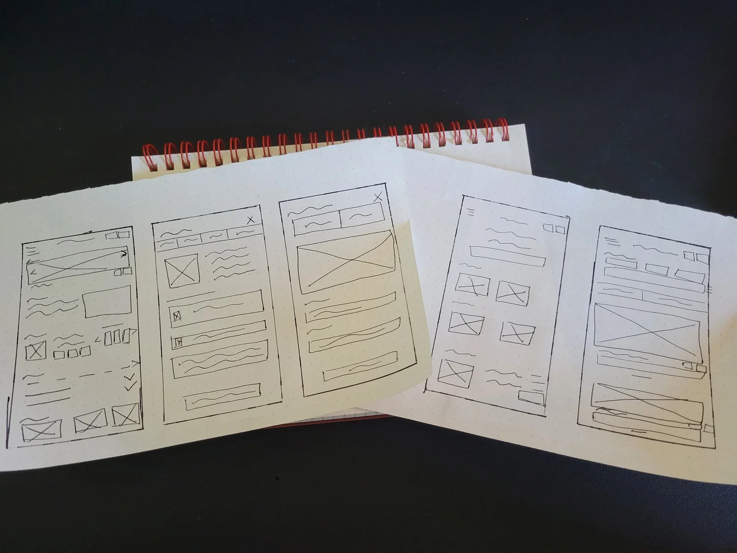
Wireframes
I began by sketching low fidelity wireframes to plan out high level functionality of the app which reflected user needs based on the User Persona and user flow diagrams
Mid fidelity wireframes were then produced. At this stage, focus was placed on conveying form and function of the UI by adding details to additional screens (basic UI elements, illustrations, text, etc.) with minimalistic design which would lend itself to being scaled to other formats such as tablets and desktop

Moodboard
In order to define the visual direction for Premier Properties, I created a mood board. This assisted in gathering ideas and establishing a tone and direction for the project
Visual Style Guide
View full Style Guide here

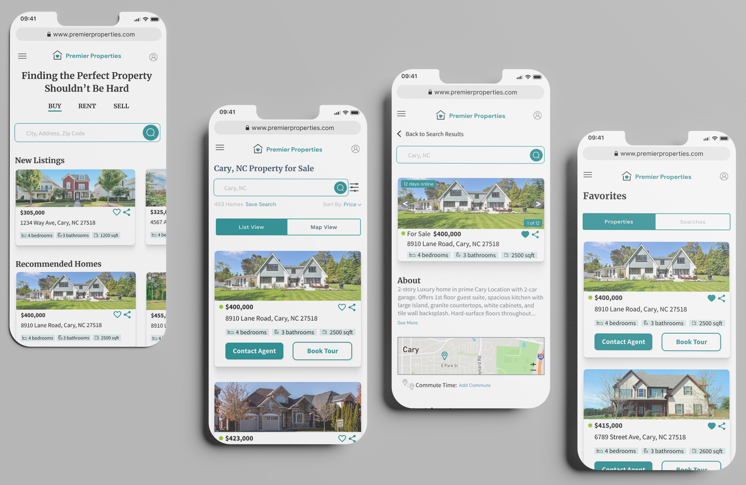
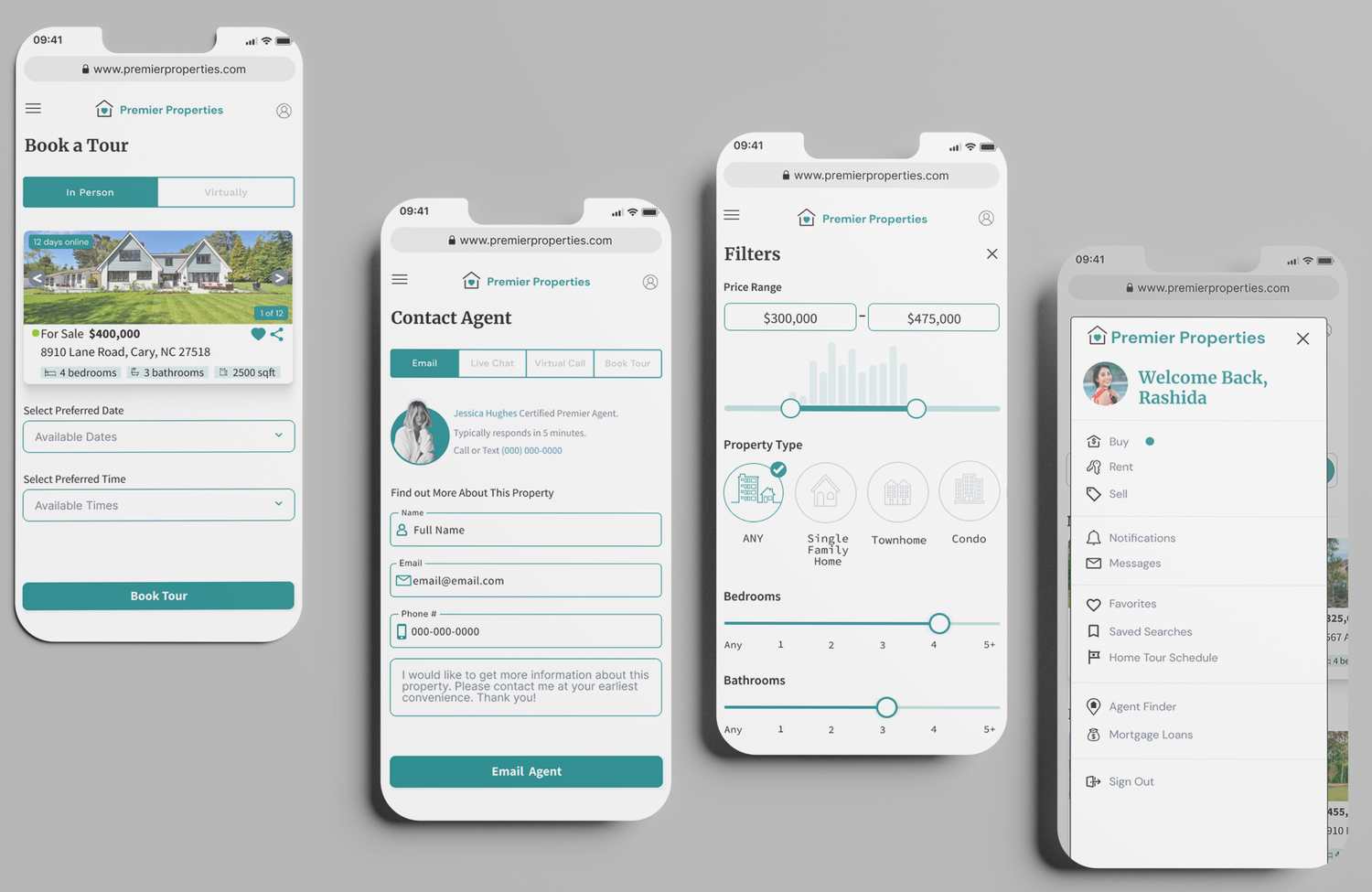
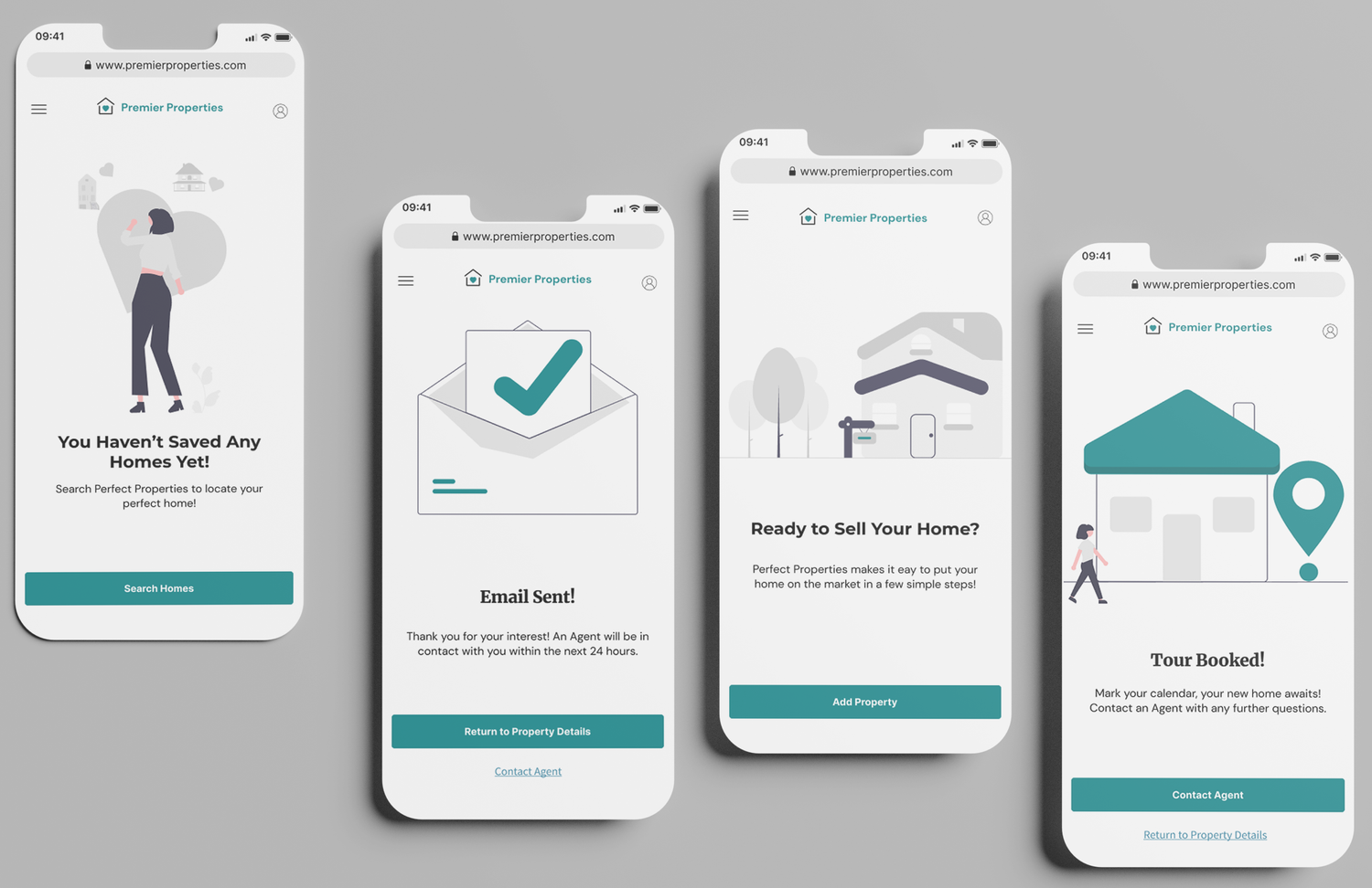
High Fidelity Wireframes

Animation
“Heart” your favorite properties, so they’re easily accessible to you in future searches
Video (with no audio) showing process of how users can press “Heart” icon to add property to favorites list
Responsive Design Breakpoints
To begin making my designs responsive, I followed industry standards to determine tablet and desktop breakpoints and scaled them based on current existing mobile grid. I then applied the visual design as dictated by the Premier Properties style guide to the wireframes
Low Fidelity Sketches
High Fidelity Wireframes
