
Overview
Timeline: 2 Months
Role: Product Design, Research and Strategy, Wireframing, Prototyping, Interaction Design
Tools: Figma, OptimalSort, UsabilityHub, Zoom
Objective: People are seeking tools to help them stay on top of their health and wellness, as well as for greater balance between the challenges of health, wellness, work, and life in general. Create a one-stop solution for well-being that will educate users and support them in maintaining a healthy, balanced lifestyle.
Design Process
Understanding the Problem
Problem Statement: HealthHorizons users need a way to securely store their medical information as well as be provided education on how to maintain their health and wellness needs. They will need a method to track their progress towards identified goals so that they can lead an active and well balanced lifestyle to avoid negative health outcomes. We will know this to be true when we see daily engagement with the app leading to the user incorporating resources provided for positive life changes.
Competitive Analysis + The Gap: I analyzed the 4 most popular apps surrounding the health and wellness tracking space. I found that almost none of them integrated both features of storage of medical information as well as engagement in wellness resources to assist user in achieving specific health goals. This then became my opportunity for the solution.
Following completion of market research on major players, I then performed a UX competitive analysis identifying certain elements (usability, layout, navigation structure, compatibility, differentiation, and Calls to Action). It became evident that there were certain areas of opportunities that I would be able to capitalize on to create a more well-rounded, dynamic app.


Understanding the User
User Interviews were conducted with the following goals:
Determine if users are willing to trust an application with their sensitive medical data?
Are users looking for assistance in establishing a work-life balance an in need of resources to live healthier?
Understand what motivates users to seek wellness resources
Determine how we will be able to seamlessly integrate use of app in user’s current routine without user feeling burdened by already busy lifestyle
Understanding user’s opinions on competing apps/sites they may currently use (highlights and frustrations)
Determine which apps or sites users enjoy using and specific tasks they will need to perform
Click to Review Interview Questions
Research Analysis/Affinity Mapping
The interview data was organized and analyzed using affinity mapping in order to identify trends and patterns and uncover key insights:
• Most users have a general interest in living a healthier life but unaware of how to start
• People are apprehensive of storing sensitive information for fear of data being breached
• With busy working schedules, focus is often placed on easily integrated app use with minimal life interruption
• Users are unaware of how to begin setting goals for wellness journey and want something that can be tailored made for specific situation/user needs with minimal effort
• Users had a history of starting diets, exercise plans, and gym memberships but lack of motivation/accountability and time commitments often led to failures
• Emphasis was placed on maintaining physical health (mental health not usually addressed)
• Users are mostly unaware of how to search for reputable resources related to health maintenance information (too many options, not sure what fits to their individual need)
• Strong preference was presented for resources that are quick and easy to digest (do not want to read lengthy articles, prefer short videos with quick tips)
Crafting the Personas
After defining the problem and analyzing interview data, I was able to identify certain characteristics and traits which enabled me to create my primary and secondary personas. The key insights from the affinity mapping became their goals and needs, highlighted motivations, and identified potential problem areas which would allow for creation of the ideal user experience.


User Journey Mapping
I was able to envision how my personas would use 'HealthHorizons' for certain scenarios, and what feelings and emotions they would encounter when carrying out specific tasks.
These tasks were tracked with user journey maps, and enabled me to see new frustrations and pain points I hadn't previously considered, which created new opportunities that would eliminate or reduce these frustrations.
User Flows
I created three user flow diagrams to map out experiences for anticipated user tasks (signing up, setting reminders, and sharing wellness resources). These diagrams focused on user-centered needs and provided a visual aid to assist me in planning the design of the app. This process allowed for me to better understand what the interface needed in order to provide the user with an overall pleasant and functional experience.
Ideation
Before ideating and sketching, I wanted to identify what specific features and pages would be more valuable for users. I created an initial site map based on how best I thought the information architecture for this project should work.
I completed a digital card sort using OptimalSort. I opted to set up an open card sort to allow participants to freely categorize topics so as not to bias results. I provided a broad overview of the idea behind the app without going into specifics about app details. The card sort study ran for two days with five successful participants and one abandoned card sort.
Results: The card sorting activity was very helpful in gaining insight into how to organize app content based on what is intuitive for the user. Modifications to initial sitemap were made to reflect feedback. (Next steps would be to offer closed card sort study with a larger participant pool to determine if newly created categorizes match up with user’s expectations and needs).

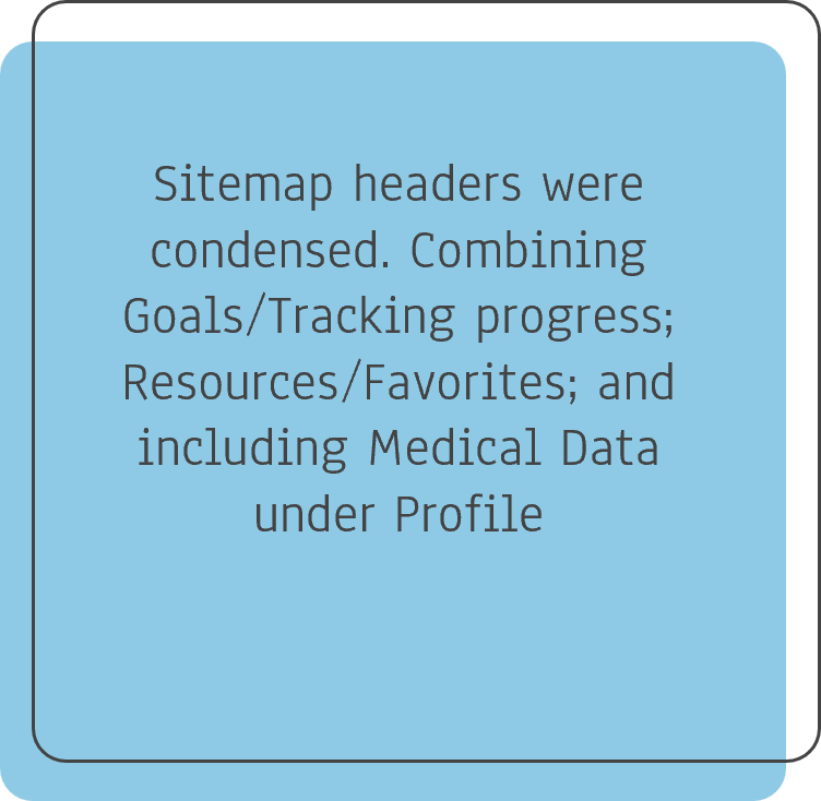

Below is the revised sitemap to represent the new structure of the platform:
Wireframes
Low-Fidelity
When the navigation, design and onboarding patterns had been developed, I wanted to add further context in the form of user stories. I created low fidelity wireframes and prototypes for the following user stories:
Login/Signup and Security Authentication
Share Wellness Resources
Log Health Information
Mid-Fidelity
Once I created low fidelity prototypes that communicated basic user flow and experiences, it was time to move onto creating mid fidelity wireframes which showcased the functionality of the app.
User Research
Usability Testing
With findings from my initial research, the restructured information architecture, and mid-fidelity designs, I initiated usability testing to inspect and improve overall usability and functionality of the HealthHorizons app.
Usability Test Plan
5 usability tests were conducted each being 15–20 minutes. Moderated in-person or Moderated remote test methods were used depending on the participant’s location. The main goal of the usability tests was to observe how the design scores in Learnability and Errors according to Jakob Nielson’s scale. Click to review full Usability Test Plan and Usability Test Script
Affinity Mapping
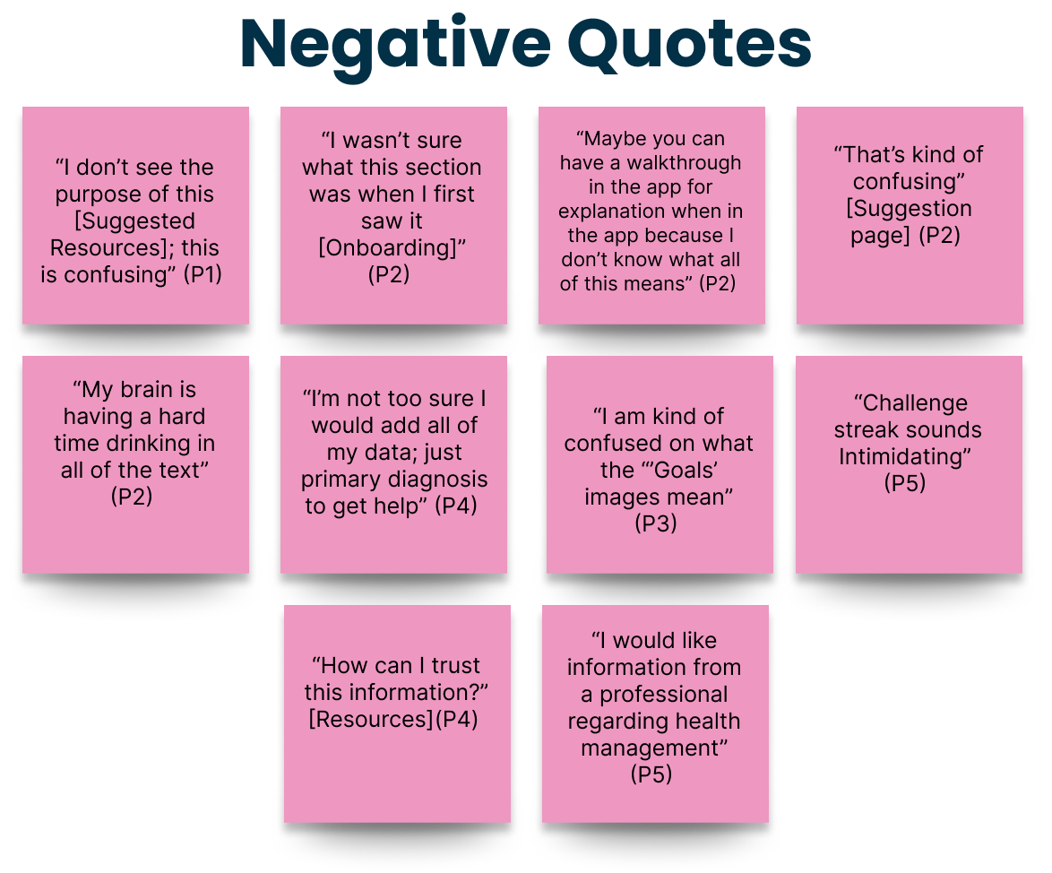
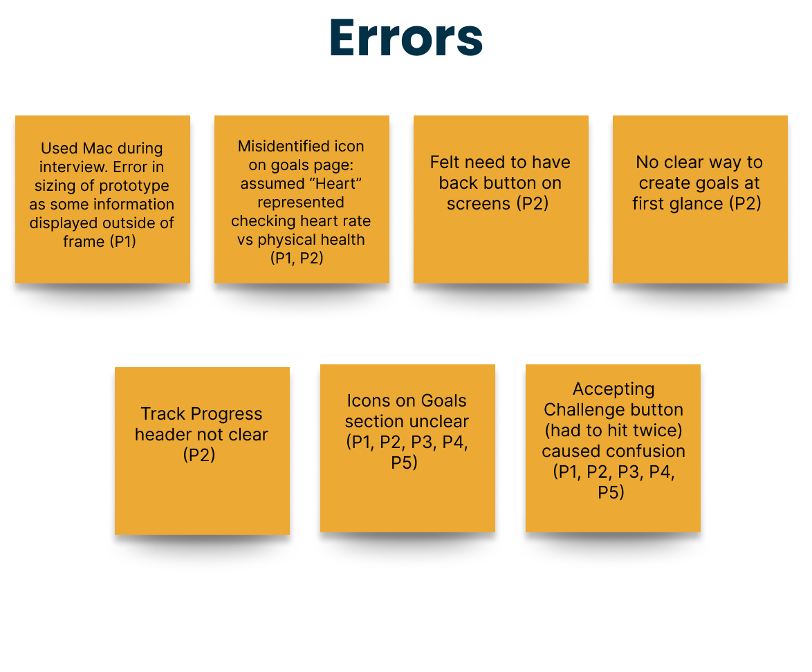
The five moderated usability tests provided critical feedback and insight into potential errors that need to be addressed and possible changes required for future iterations of the HealthHorizons app. Information gathered during usability testing was organized visually into an Affinity Map then further refined to better understand the patterns utilizing a Rainbow Spreadsheet.


Rainbow Spreadsheet
Using Jakob Nielsen’s error rating scale, the usability test findings were rated by severity and organized in a Rainbow Spreadsheet. (Click to Review HealthHorizons Usability Test Results)
Critical issues were identified and the most important errors highlighted to address and resolve any major usability problems.
Refining the Design
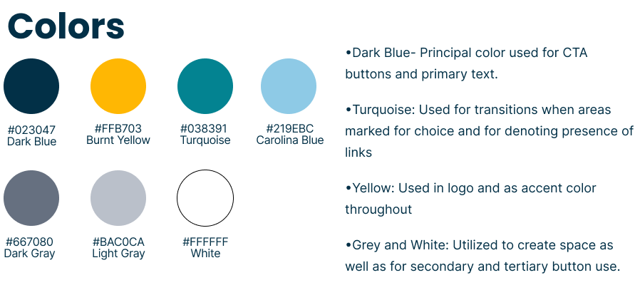
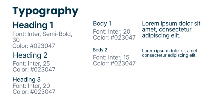
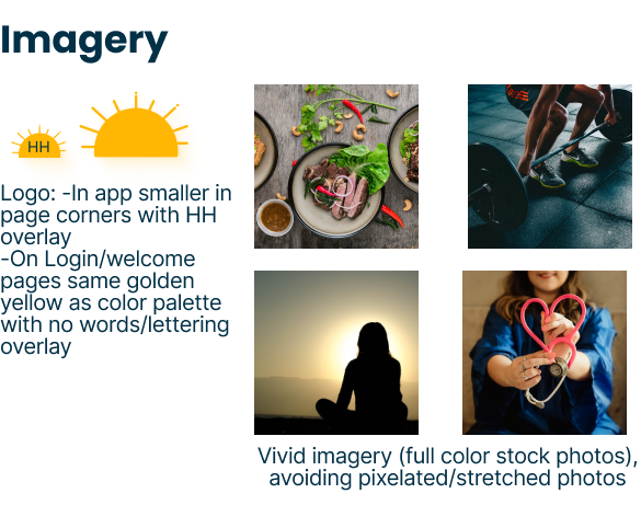
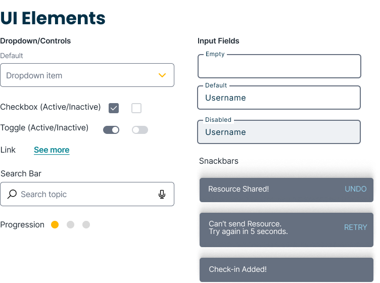
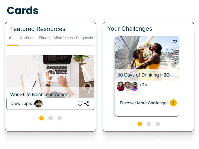
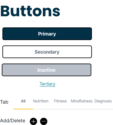
I created a Design System to ensure consistency across all user screens. The Style Guide showcases the visual design principles of the HealthHorizons app. I wanted to evoke feelings associated with productivity, accountability and well-being (all characteristics we want to promote in user while engaging with the app). As health improvement apps can often feel complex and intimidating, I attempted to create visuals that were approachable and straightforward, so users feel more comfortable using it.

The design of HealthHorizons was continuously iterated, reflecting feedback from various sources. Initially, I addressed issues identified from usability test participants. I then further refined the prototype by completing preference testing and receiving evaluation from peer reviews.
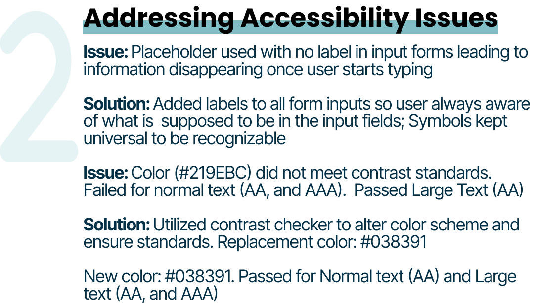
3 Major Improvements Made To My Design


Based off of user research, interview analyses, usability testing, and peer collaboration, I created high-fidelity designs for the HealthHorizons app. I aimed to create a platform that is easy to navigate, visually pleasing with accessibility in mind to be able to accommodate a larger range of users.
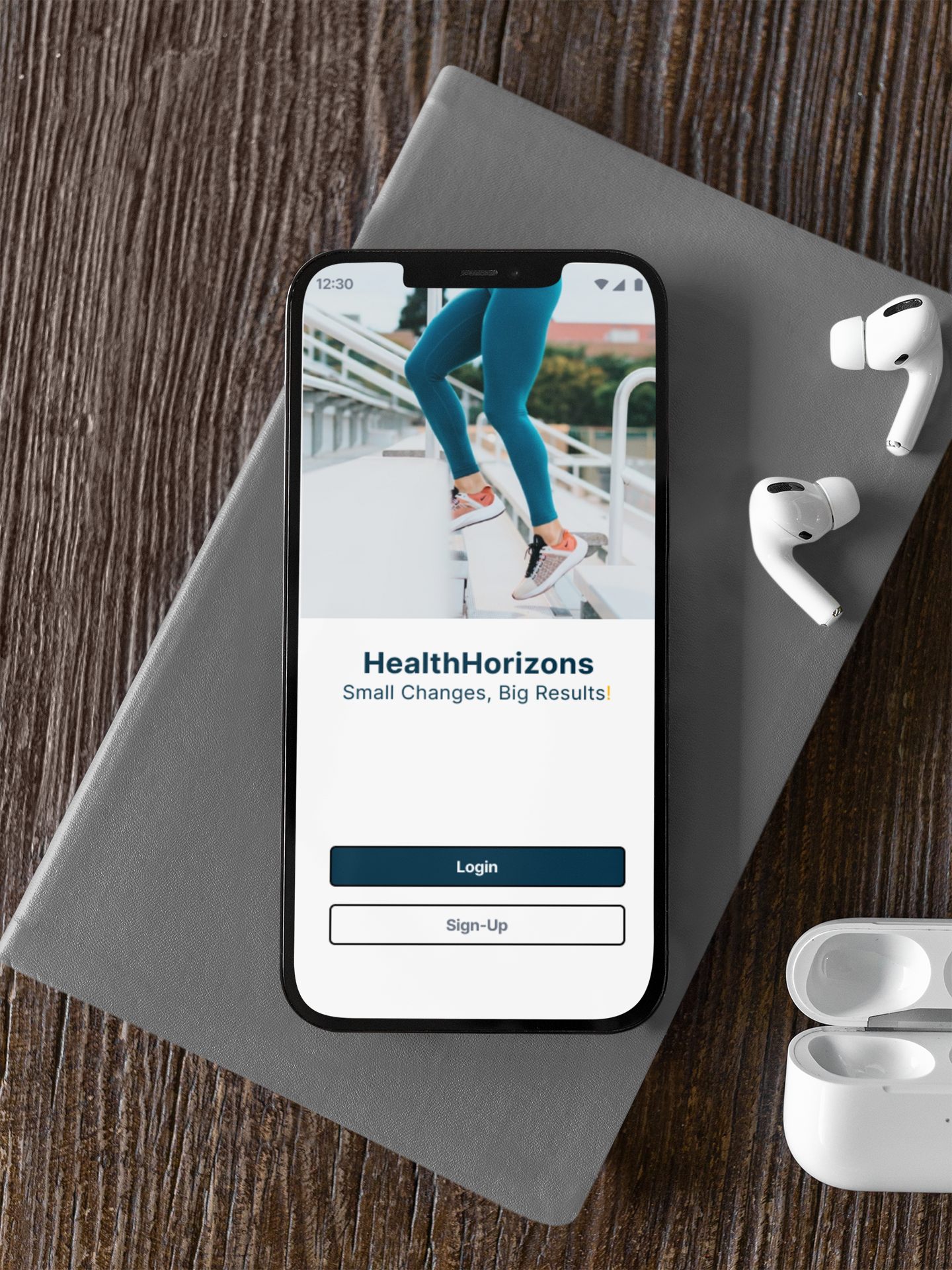
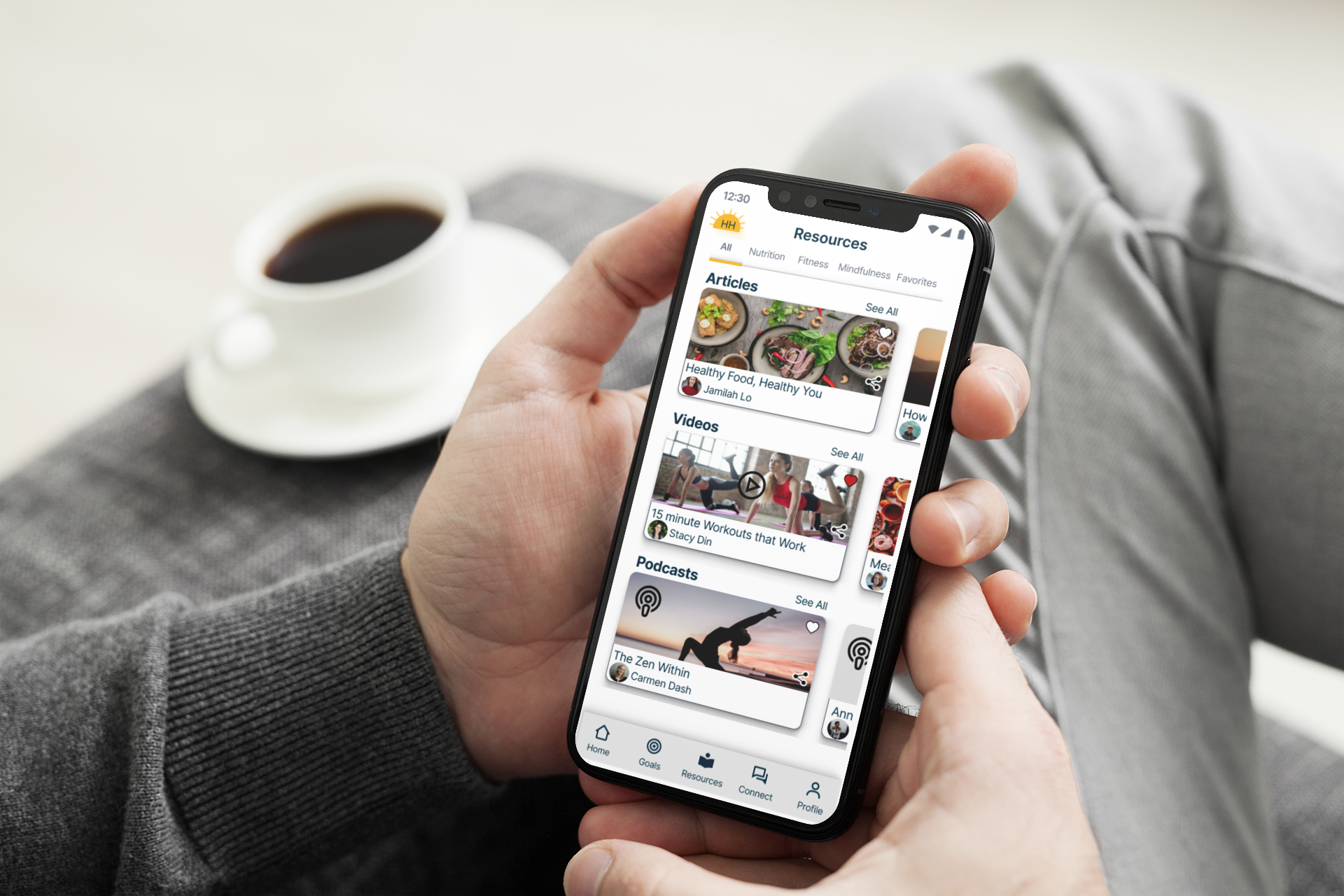
High-Fidelity Wireframes


Mockups


Reflection
What I learned:
Ensure that every aspect of the app is designed with intention. Emphasis must be placed on accessibility (vs. solely visual appeal). I now have a better understanding of how to maintain WCAG standards the first time around!
Design collaboration is key! From identifying errors to uncovering more foundational problems in my app, I’m grateful to have had the opportunity to receive feedback from my social network, peers, tutor, and mentor. Ultimately, I was able to create a functional, user-centered app that met project objectives.
Next steps:
Because of the time constraints in completing the project, I decided to focus on a mobile-first approach and designed only the mobile version of the app. It could be beneficial to expand to the desktop platform and offer more expansive features should the user want to have access to the app when not on the go
Expand upon ways to track achievements and setbacks which will enable users to remain on track with specified goals.
As this is an iterative process, I will continue to fix and manage usability issues that occur